Introduction to Designing for Interaction
For the first task of this module we had to analyse the HUD of a game of our choice, describing and commenting on the various elements and explaining each of their functions. For this exercise I chose Fortnite, as I found myself playing this popular battle royale whenever I have free time as of recently.


The HUD is separated in multiple bits on screen, each one showing different shapes, numbers and values which provide vital information to the players.
-
Health & Shield section - is nothing special compared to other games of this genre and many more. The player starts the match with 100 health (green bar) and 0 shield (bar on top, blue once it starts filling up). You acquire shield from items such as small or big shield potions, chug splashes, etc. Taking damage from enemies will start by depleting your shields bar and then your health bar.
-
Players information - is situated above the Health & Shield section and offers information about the players, such as who killed who.
-
Loadout - is placed on the opposite side of the Health and Shield section. Like the name suggests, this section of the HUD provides information about the player's loadout. The left-most square is always allocated to the harvesting tool, which besides being used to harvest materials, is the player's only weapon and means of defense until they find guns, although it is proved useless against a player using guns in most cases. The other squares are for potential weapons or usable items the player collects, such as healing items, treasure maps, etc. Apart from the harvesting tool, the inventory is emptied at the end of each match, unless the player has a tent in which they put weapons in, in which case they can carry those weapons over to their next match.
-
Building & Materials - is situated above the Loadout section. The materials players can collect are Wood, Brick, and Iron, which can be used to build structures to either defend themselves from enemies, or make it easier for themselves to access certain areas of the map. Below this is the Structure Bar, showing players the structures they can build (wall, floor, ramp/stairs and lastly, pyramid-shaped roof)
-
Inventory - is placed above the Building & Materials section. The inventory doesn't occupy a lot of space on screen because if you pres TAB, it brings up a different menu for the inventory, showing the weapons and consumable items at the bottom row, and ammo and building materials on the first 2 rows. Like the Loadout, the inventory is reset at the end of each match, besides the gold bars players can collect. Players can also craft from the inventory menu.
-
Minimap - this shows the player where they are at any given point during the match. Below the minimap there are some numbers and symbols. The first one is a timer that tells the player when the storm will start closing in. The second one tells how many players are left alive in the current match. Third one tells how many kills you have. Fourth one shows how many kills your team has.
-
Compass - is at the top of the screen, in the middle. This section gives information about the direction you are going. Occasionally, you can see flashing red dots, indicating gunfire in that direction.
-
Storm Information - additional to the timer below the minimap, the player can see occasional text information about the storm.
-
Visual Audio Cues - is an optional setting players can turn on and off. It helps visualise close-by gunfire, animals, chests and so on. This bit of the HUD was specifically designed for people hard of hearing or worse hearing problems, offering them a fair chance at playing this game.
In conclusion, I think Fortnite's HUD is simple, offering all information the player needs to be able to play the game, while also being user-friendly and inclusive for people with hearing problems and disabilities.

Proposal for group project - Bounding Steps
.png)
For Designing for Interaction, me and a group of fellow students had to band together and create a short game.
The aim of our project was to make a simple game that exemplified the core aspects of good User Interface (UI) design and generally good User Experience (UX) design, these core aspects being: informing the user of their objectives, capabilities, opportunities and limitations within our game, all as quickly and concisely as possible, preferably with as few words as possible.
Our game would be called Bounding Steps, and the details for this project can be read in our initial formal proposal below.
In charge of 3D modeling, texturing, UX/UI design
In charge of coding in C#, main menu art
In charge of grey boxing, building the levels
Additionally, we will help each other with our assigned tasks and work together on the documentation.
Down below you can read our first formal proposal:

Goncalo Miranda

Lorena-Maria Neagoe

Scott Ollard
Bounding Steps Adobe XD Prototype
Adobe XD is a software made especially for the creation of user interface designs and prototypes.
We had a quick run through of it's features and one of our team members, Lorena, made our first ever concept art for the game's menu.
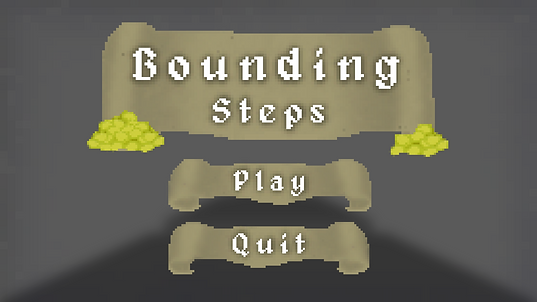
As it required to be drawn, it ended up being more work than we thought was worth, so it was crapped and replaced with a much simpler and traditional menu design.
The original idea was to show the world the player would inhabit and it's dangers.
A dynamic angle would grab the players attention and the game character would almost lead the player's eyes onto the options in the menu, so overall I think it's a solid concept.
Due to time constraints, changes of plans and focus being split between different projects, the menu was turned into something much more traditional and easy to grasp.
This is our current concept for the game's menu.
With the changes of plans that occurred throughout the game's development, the setting and ambience of the game changed, thought this will be explained in future sections of this page.
The background featured here is merely a placeholder, the game itself would be the background of the menu.
User Persona
A user persona is described as follows:
"User personas are archetypical users whose goals and characteristics represent the needs of a larger group of users.
Usually, a persona is presented in a one or two-page document. [...] Designers usually create user persona template templates, which include a few fictional personal details to make the persona a realistic character [...]."
.png)
Lewis Jones is looking for fun, casual retro games to entertain him in his free time and also possibly stream on platforms like Twitch or YouTube. Due to his full-time job as a barista and wanting to spend time with his fiance, he prefers short, but still action-packed games.
His main criteria when looking for perfect games for himself are: retro, pop culture-inspired and of a short duration to fit into his tight schedule. We made Bounding Steps for gamers like him, giving them a short, fun platformer, reminiscent of retro games and pop culture influences like the original Tomb Raider games, Sly Cooper, Sonic the Hedgehog platformers etc.
Lewis would find our game a great match for him and his gaming needs as the game is easy to play and master, with basic platformer controls like spacebar to jump and WASD to keep advancing, and a simple UI that offers players all information they need to enjoy the game . He’d play Bounding Steps because it would remind him of big retro games titles, while also bringing new ideas and concepts to the table.
Dev Journal: Bounding Steps Game Project
To start off the project, our group needed to decide what our game would be.
From the very start, a platformer was in consideration, and after going through other ideas, we settled on creating a simple, obstacle based, 3D, first-person platformer, visually inspired by classic dungeon crawling games and Indiana Jones and mechanically inspired by Minecraft. The idea was simple and achievable, so it was ideal to create an actual game while being able to show off functioning UI and HUD elements, which was the main objective.
Multiple Level Concept
Originally, our game would have 4 levels: a Tutorial, with a water theme, a Main Hub, with a grassy valley theme and a Dungeon and Fire levels with the objective of obtaining keys to open the path to the End of the game.
The tutorial level was briefly worked on to try and visualize certain aspects of the game before full on development started, but we ended up scrapping the idea.

Initially, the art style for this first concept would be based of of Minecraft's cubic and modern retro look, though only a single asset was made, to test out how the modelling and texturing would work.


Modelling was predictably simple, though getting edges perfectly straight and even was sometimes challenging due to software issues.
This was more so a way to test out texturing. A pixelated look was the objective from the start, so Gonçalo ended up testing a method which involved just taking a picture from the internet and lowering its quality. This worked a couple of times, but was very unreliable and inconsistent, so it was not used moving forward.
Single Level Concept

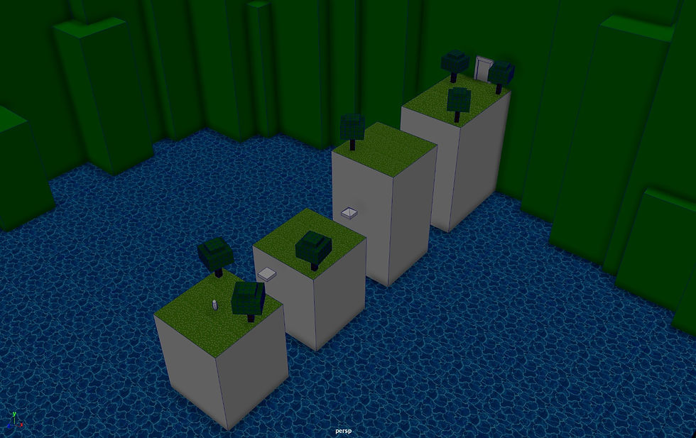
We realized that making 4 separate levels would be too much to pull off with the kind of game we were making, so we cut it down to just one: the Dungeon. The objective is to, as you explore the dungeon, collect coins and grab the key to unlock the treasure at the end of the level.
It's a simple level concept that's very achievable, and it enabled the creation of fun assets and textures.
But before that, we visualized how the level would look and move.
These are very basic greybox visualizations made in Maya. We wanted to use multiple types of obstacles to add variety to the level, mostly for the sake of it, as it wasn't critically important.
-
Normal Platform - A simple, unmoving, floating platform;
-
Moving Platform - As it moves, the player needs to move with it to not slip off;
-
Sliding Platform - It comes out of the walls and the player needs to traverse it as the time moment;
-
Bouncing Platform - A platform with a magic crystal to make you jump higher.
Due to the Bouncing Platforms, the level had to incorporate elevation is some way, so throughout the level, the player will go up and down the dungeon floors.

As this was the more developed and liked concept among the group, this is what we ended up going for.
Full On Development
Asset Creation was the first element of the game's development that reached completion, as it was relatively simple. bellow will be some screenshots of just a few of the assets, mainly the most visually diverse and telling of the game's art style.


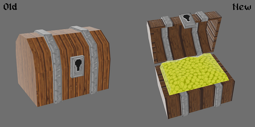
And as you can see, the assets were textured in a retro pixelated style. These textures were all created from scratch in Photoshop by Gonçalo, instead of relying on previously existing images. The way this was achieved was by simply drawing in a 40x40 pixel canvas, then scaling the entire image to 1000x1000 with a specific setting.
This took a bit of practice, as seen with the old Chest texture. Thanks to this chest, early on, we realized textures needed to be more bold, with defined edges and differentiable colours, to help the model look less flat and uninteresting.
But as there are many textures to show, all of them will be neatly compiled bellow.


Geometry & Platforms
Door, Chest, Spikes & Items
Decorations
Menus & UI Design
Since we're creating a game, creating menus was a critical step of the user experience. To keep the visuals consistent, Gonçalo used the same techniques explained previously to create retro looking Titles, buttons and sprites to decorate all of the menus and the players Heads Up Display, or HUD.

The Main Menu, fittingly, was the first menu to be created.
Scrolls were used as the background of text, to go with the 8bit/retro medieval look of the entire game.
The font that was used, Alagard, also fits with this aesthetic.
While creating the Death/Game Over screen, we decided that adding a bit of humour would help with the game's over all experience, since if the player dies, having it be taken seriously is not as fun.


This was the final concept for the HUD the player would see once they're in the game.
Although initially the level's objective would pop up to inform the player, we felt implementing objectives and tips into the level itself as wooden signs would be more interesting.
Once the player reaches the end of the level and claim it's treasure, they're presented with the You're Rich! screen, serving as the game's final menu.
Don't spend it all in one place!

Game Building & Coding
After the assets and textures were made, the game itself needed to be made. Scott was in charge of putting everything together. At this point, our group was still a bit unfamiliar with Unity, so other than the expected learning period, this part of the process was relatively simple as well.
There was, however, one hiccup during this stage of the game's creation. Due to a problem with Unity, the size of textures on the game's general geometry (floors and walls) was unable to be changed. In this case, the result is as seen bellow:

Other than the level's geometry, all other assets worked as intended.


When it comes to coding, the process was relatively simple as well, although, since this was Lorena's first time coding a proper game level in Unity using C#, and not C++, which she has a background in.

This is the code used to program one of the buttons on the game's main menu, specifically, the Play button.
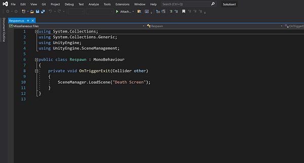
This code created the Respawn system, in case the player failed in crossing the game's obstacles.

And this code was used to create the Footstep sound effects, while adding variety to them, so that the same sound doesn't repeat over and over.
For our SFX, or Sound Effects, we wanted to use retro or 8bit sounds, to fit with the rest of the game's aesthetic and atmosphere. This involved searching for either pre-existing sounds or non 8bit sound effects that could be turned into 8bit through the use of settings and effects in softwares such as Adobe Premiere.
Bounding Steps Peer Review
After finishing our game, we asked fellow student groups to look at and review our game, giving their opinions on several aspects of our game, to see what could be improved on and what worked.
You can find the answers received HERE.
We were aware of some of the game's imperfections, but due to inexperience, we weren't able to iron everything out before the eventual deadline.
Final Project Evaluation
While a bit shaky, overall the development of this project has been one of our most positive.
There are changes that we'd like to make to the final result, like changing how the platforms function and some corrections to the visuals, but these are things that would require more time and experience.
The project took a while to finish, but it's wise to keep in mind that other group and individual projects were being worked on simultaneously, so speed wasn't a guarantee.
We are confident that fellow students enjoyed their time playing through our project, as seen with our Peer Reviews.
And we feel that we worked as a team pretty ideally, everyone did their parts efficiently and well within expected deadlines, so we are happy with everyone's execution of their tasks.